
DENVER — Denver neighborhoods separated by a short 10-minute drive saw a huge gap in the amount of COVID-19 cases during the peaks of the pandemic, according to a new report from the Colorado Health Institute (CHI).
A group of researchers put together a deep dive into neighborhoods throughout the Denver Metro called CHORDS data, collecting demographic characteristics and more.
The data in the report specifically looks at the period between April and December of 2020, the peaks of the pandemic and before the vaccine were widely distributed.
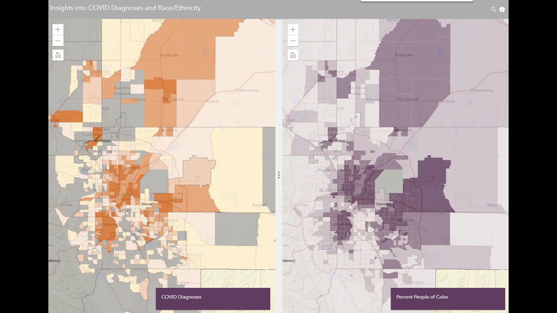
One of the key takeaways listed in the report is that the highest COVID-19 diagnoses were found in neighborhoods with lower education levels and with higher concentrations of non-English speakers and people of color.
"...what this map is really spotlighting is not where people were careless and got COVID, but where where people's lives were built in such a way that it's really hard to avoid COVID," said Joe Hanel, the Communications Director at CHI, who was also the Research Director of the project.
>> To read the full report, click here.

A short drive makes a big difference
A few comparisons between neighborhoods are made throughout the report. Still, one that sticks out to researchers is comparing the Westwood and Platt Park neighborhoods - separated by just under 5 miles.
The Westwood neighborhood's Southwest area had a little more than two and a half times of COVID-19 cases than the average of the analyzed area.
According to the report, it's also ranked among the five census tracts with the most non-English speakers and people of color.
The Platt Park neighborhood had just 32% (or less than a third) of the average COVID-19 diagnoses. The neighborhood's census tract shows the percentage of people of color at 13.4%.
"...the patterns that we're seeing really go beyond income or beyond poverty, if you will," said Guadalupe Solis, a Research Analyst with CHI, and was heavily involved in producing the report. "...what we're seeing here is that there are other factors such as educational attainment or, you know, the language that you speak at home that really will influence disease distribution or just the likelihood of someone contracting COVID-19."
Another comparison includes Denver's Montbello neighborhood, which had some of the highest COVID-19 case concentrations in the study, totaling 214% of the average. It also has some of the highest census tracts with the fewest high school graduates, among other things.
The Central Park neighborhood is not far from there, and its census tract had just 45% of the average COVID cases, according to the report.
The neighborhood ranked among the highest for education, with nearly all its residents (99%) having a high school diploma.
Solis said the patterns seen should not be looked at in a stigmatizing way, rather a way to recognize where more resources are needed.
"Some neighborhoods do have lower educational attainment rates, but that's not purely from individual choice, but more from the other systemic barriers that are in the way, right, for people from certain neighborhoods to obtain a higher education or or even receive the same level of care in a different language," she said. "...if we don't implement these practices of informing communities and really getting to the to the root of the issue, we will see these same patterns happen during the next pandemic - unfortunately..."

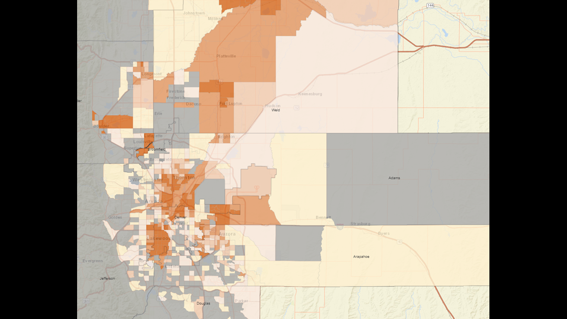
The pattern of comparisons on the map is known to researchers as the "upside-down L."
The report lists it as a stretch along Federal Boulevard on the west side of Denver and along the "northern rim" of the city east to the Montbello neighborhood.
The area also appears to have a higher concentration of COVID-19 cases during the time analyzed in the report.
"These neighborhoods have kind of been pushed out due to, you know, infrastructure changes or redlining historically," Solis said. "...these patterns are here. They're solidified and they will continue to happen unless, you know, changes are made or something is addressed..."
What's next?
The team hopes to continue presenting their findings to bring more attention to where resources or change are needed in underserved neighborhoods.
Additionally, Hanel hopes that they can someday soon overlay vaccination rates on top of the current maps and see where an access problem may match up next to the rate of COVID-19 diagnoses.
"...we have maps on our website about vaccination rates, but what we were lacking was this, the main, "what did COVID actually do to our neighbors and who was affected more?" So now that we have this kind of linchpin, I think we'll be able to structure a lot of our other mapping work around it," he said. "And when it when it comes to maps and health interventions, the more detailed you can be, the better. So we're really hoping this is going to help a lot of people working in COVID prevention and working to to end this pandemic once and for all..."
SUGGESTED VIDEOS: Latest from 9NEWS